Quantcast
Channel: these beautiful pens
Viewing all 94 articles
Browse latest View live

The Raden Pelikans

$
0
0

Pelikan M1000 Sunlight and Moonlight side by side


Got enough of the sparkly stuff already? Then bear with me just a little longer for I've got some more comparison shots to show.

Pelikan M1000 Moonlight & Sunlight
As you can see, the Raden stripes on the Sunlight, although narrower, catch the light more readily and give a more vivid reflection. The Moonlight gives a more peaceful overall impression. (Just came across an eBay listing where the seller had a wild mix of Sunlight and Moonlight pictures in his auction. The auction was about the Sunlight only. Zzzz... It's not that hard to see the difference, is it?)
Pelikan M1000 Moonlight & Sunlight

I haven't managed to take a really good photo of the artist's signatures so this will have to do. As you can see the pens were done by different workshops/artists. It doesn't bother me but it's still a weird thing to do when you're planning to issue a duo of pens.
Pelikan M1000 Moonlight & Sunlight
So which one do you like better? I find it hard to decide.


Daily survival kit

$
0
0
When I go, these will go with me...

Women in general are infamous for the amount of things they "need" to carry around with them on a daily basis. In fact though, most people of either sex have a basic "survival kit" of items which they like to have close most of the time. So do I on most occasions when I leave the house for a longer period of time. Here's some of my daily stuff, in random order:


- notebook with handmade leather cover: for some work basics, intermittent strokes of genius as well as random things important enough to be put in writing. I made a separate post about this kind of notebooks here: Hand made leather journals - the work journal


 - appearance rescue kit: comb, powder, lip balm. Probably the one "female" point in this list. The comb is a really cute little toy made from horn which was a gift from a dear friend - an essential since I have long hair. Can't do without the lip balm either. At the moment it's plain shea butter, but I also like scented ones. Also like Blistex and Carmex for that cool-mint feeling.


- phone (SGS III): I'm not a huge fan of talking on the phone. Mobile phones became attractive to me when they started offering mobile internet access (and the phone companies started offering reasonable prices for using it). I rarely call people or receive phone calls on it but still find lots of uses.


- e-reader (Kindle PW): There has hardly been any time in my life where I haven't gone through a few pages of a book every day. Like most bibliophiles I love the look and feel of a printed book. I also want to keep my paper books in the best possible condition. Carrying them around doesn't add to that whereas the kindle sits safely in his rugged leather sleeve, bearing no notice of harsh environments. I've had a Sony e-ink reader for two years until I received the PW as an early birthday present. (Thanks!) Awesome: some of the default screensavers show fountain pens and dip pens.
Currently reading: Andrzej Sapkowski's Witcher series.


- Visconti 6 pen case: This is definitely one of the more awesome cases around. When it comes to pen cases, I'm a cheapass or, maybe more accurate: My standards of what is a reasonable price for an item may be distorted, but only when it comes to fountain pens. I'm not ready to shell out ridiculous amounts of money for pen cases though I do want to have my pens protected. The Visconti pen case comes in several sizes from 1 to 12 pens, it's a leather covered hard shell case and very reasonably priced. It carries the six pens I can't live without for the moment. The one that's peeping out is a Nakaya Negoro, you can find out more about that pen here: Oh noes it's broken!

Are you a watch-wallet-keys minimalist or do you lug half your household around for the day? What are your daily carry items?

P. S.: Of course I also carry keys, a wallet, something to eat and a bottle of ink! I just don't deem those interesting enough.

P. P. S.: I'm glad I took those pictures last week because today I'd freeze on the balcony. Brr! Spring, get a grip already!

Nibs, nibs!

$
0
0
Every now and again I am fascinated purely by nibs. When compared to a felt tip pen, a nib is a pretty high tech device to write with. Some of them may be faulty out of the box due to this but - and I guess there's no need to tell my readers about this - a well writing nib is just like nothing else.

Plus, as the nibs grew larger and larger over the past century, they have become canvas for artwork and designs.

Below's the gargantuan nib of a Danitrio Genkai. It's the same size as the Pelikan M1000's nibs but feels smaller sitting on the pen. The nibs are beautifully soft and wet. The pen itself is plain Urushi which makes the intricate platings and carvings on the nib shine even more. For pictures of a Genkai (though serei-nuri and not tame-nuri as the one below) as a whole look here: A large canvas: Danitrio Genkai


Danitrio Genkai: large pen, large nib

Another example how the nib design is part of the pen's overall look on the Montblanc Agatha Christie. Montblanc have brought this to perfection in their writer's editions, each having their own specially designed nib. This one is like writing with a snake - sounds weird, but the whole pen is really amazing work. I've blogged about another writer's edition with an equally unique nib here: Montblanc Jonathan Swift

Montblanc Agatha Christie

Do you have any favourite nib designs or shapes or is there any on this blog you'd like to see more of?

Hot tea in June

$
0
0
Okay, I've really been trying to keep the weather out of this blog, but as the recent streak of chill and rain doesn't seem to end anytime soon, it seems I just have to tell you how extremely annoying this is.

On the upside it's just the right weather for reading, writing and doodling while sipping a large mug of delicious lemon-ginger-mint tea. What you need is:

  • 2-3 sprigs of fresh mint
  • a little piece of ginger
  • half a lemon, preferably organic
  • honey.


Peel and grate the ginger until you have about half a teaspoon of ginger mush. Also grate a bit of the lemon peel. Use your hands to queeze the lemon joice into your cup, then cut the lemon into pieces. Add those also. The mint sprigs can be added as a whole. Add everything to your cup along with a teaspoon of honey. Infuse with boiling water (best use a large mug that holds 0.3-0.4 l). As soon as the tea is cool enough to be drunk it is ready.

I find this to be one of the most delicious drinks ever. Besides the ginger and lemon juice will hopefully prevent colds.

Design.Y leather journal

$
0
0
Design.Y "EP Record" leather journal

Today I'd like to show you some details of my rather new leather journal made by Design.Y - near mint in Japan. It's their newest model in A5 size, called the "EP record" (though sadly there's no record included! I would have been interested in the sound).

In my opinion the details are what makes this notebooks truly special, but I'm planning to show some larger scale pictures, size comparisons etc. as well.


Design.Y "EP Record" leather journal

The cover which is thin but stiff is made of finely grained veg-tanned goatskin with a beautiful smell. It's available in black and brown, I chose a matching cream colored ribbon.

The paper doesn't have a smooth edge like in their smaller journals but has a hand stitched feel to it.

Design.Y "EP Record" leather journal

At the back side of the journal their logo is embossed into the leather. To me it looks like a person doing this: \o/

Design.Y "EP Record" leather journal

I don't like thin journals so this one is just right for me. Filled with 480 (!) pages of creamy white and super thin but still immensely fountain pen friendly Tomoe River paper this provides enough room for noting a lot of thoughts, writing about many months of your life, making a very long journey or writing a novel - maybe even two.

Cat content

$
0
0

Tiny, silky soft and not pen related


The last weeks haven't given me much time to play with my pens or take pictures, mostly because of these two guys who moved in with us last Saturday!

Linus (cream) having an eye on Chaplin (red)

They are called Chaplin and Linus, they're brothers and thirteen weeks old. They love to play, grapple with each other and cuddle with one another and humans alike. They are extremely attentive to everything going on in the house, especially if it's making a crinkly or rattling sound. Being separated from their mother and their other siblings must've been hard on them but they've taken it really well and seem to feel quite at home as long as they've got each other. The first days they always stuck together closely but meanwhile they seem to feel safe enough to sleep in different rooms or do different things for a while.

The first time we saw them in the middle of April, by then they were hardly three weeks old and the long wait began - not quite as long as for a new Nakaya but still long enough!

Linus

As you can see, their eye color doesn't seem to have fully evolved yet. At the very edge of the iris they're still kitten blue, but the amber around the pupil will probably be the permanent color.
Warning: nasty phone snapshots following!


As our balcony is three stories above ground level and the railing wouldn't keep a cat in we decided to attach a net. Unfortunately the weather isn't warm enough at the moment but it seems they will like it a lot to be outdoors when it's warmer.

As soon as we get a bit more sun (I'm reluctant to use the flashes at the moment with the kitties around) I'll post some more pen & paper content as well - there's some pretty nice Monsieur Notebooks I'd like to show you, Rivoli stationery and a parcel from Paper Republic on the way!


A glimpse at Paper Republic

$
0
0
I've been quite busy lately, writing, work and last not least kitties have been keeping me occupied. Still I have at least a small snapshot of pen & paper content to show.

Nakaya Negoro fountain pen on Paper Republic Noto Notebook

This is my Nakaya shiro-tame nuri Negoro - more about that one here - resting on a notebook from Paper Republic. The Viennese manufacturers exclusively use hand printed Japanese papers for their notebook covers. I'm a big fan of those papers, the colors are gorgeous, the range of designs should offer something for everybody and they have a beautiful cloth-like feel to them, much like the covers of those Jenni Bick journals I mentioned earlier. Else they are pretty plain (too plain for my taste were it not for those adorable covers), filled with 96 pages of white Swedish Munken paper which means they are quite slim. They come in pocket and A5 size and if you choose to order one: shipping is free worldwide.

Munken paper has its fans among fountain pen users and I got to say there's no bleedthrough but the paper makes your lines appear wider than usual so a medium to fine nib is in order. On the upside drying time is very short and the paper has a nice substantial feel to it with a hint of feedback. I'll post some more conclusive pictures and more detailed info on those notebooks later.

I'll be off on a short vacation now and soon after that I'll be getting a new camera which will hopefully mean: more nice pictures for the blog. There's no lack of pens and papers standing in line to be reviewed. Have a great summer, everyone!

The colors of sunlight

$
0
0
August is here and we've had a really hot summer so far! Not being used to temperatures above 35 °C, for a few days it was just splashing in pools, having cold drinks in the shade and midday naps in the house and sweating at every smallest action (or without any, even).

The upside - besides the obvious ones - was this summer provided the perfect opportunity to use my new sunglasses! World's best boyfriend gifted me a coupon for some really nice sunglasses for my birthday back in April and now I finally got around to picking some.

"Happy moment outdoors" kit: My new sunglasses and a letter from a friend.

These are polarized glasses by Maui Jim and the glasses are put together by whoknowshowmany layers, each one serving a dedicated purpose. Some will reduce reflections on smooth surfaces or water, others will increase contrast etc. etc. They're very comfortable but looking through them still took some getting used to because everything looks like "let's open Photoshop and increase saturation by 20%". Traffic signs are redder, fields and trees are greener, clouds have a stronger texture in an almost purple sky.

Conclusion: You don't need drugs to perceive a more colorful world.

Before I even bought the sunglasses I decorated some blank Amalfi cards. Lines and letters are done with waterproof India ink and glass dip pen, then painted over with sheer watercolor washes. On the card below I used a round brush for the watercolor strokes but later I found a flat brush to work better. Amalfi paper is great for watercolor or ink-water-washes because it will take quite a bit of water (especially the cards) and doesn't eat up the vibrancy of the colors.
In the glass pen India ink will flow irregularly with blobs and splotches - I have to admit I like the effect. It adds some texture and the blobs will keep a beautiful sheen even when dried.

Amalfi paper greeting card, India ink and watercolor.

Also looks good in a similar range of colors. I did another, rather romantic version with black vines and petals under broad stripes of mangan violet, soft lilac and ultramarine.


About journalling

$
0
0
A lot of fountain pen enthusiasts keep a journal or even several ones. Besides the obvious benefits it also gives us one more opportunity to use our beautiful fountain pens!

I started keeping a daily journal when I was eleven. I also remember earlier attempts, scribbling in little A6 composition notebooks about the newt population in the garden pond and the neighborhood cat which I'd christened "Elsa" ("Born Free" was my favorite movie at that time), but I didn't stick with the project in earnest until 5th grade. At the same time I used to write stories (about horses, mostly) and illustrate them but I always kept them strictly separate from my diary.

My diaries from age 11 to 12. A path into the past, but rarely walked. ;)

The timing for starting a diary was good as it wasn't one of my best years and I believe even back then writing about it helped dealing with the more problematic stuff. I remember how some of my friends also started a diary and sometimes we would spend evenings sharing things we'd written about and read selected pages aloud. Sometimes the text felt like a totally different person than the one I knew and talked to every day; like a peephole into another world, right around the corner and yet totally hidden from view. I still remember vividly how amazing that felt.

This Chinese notebook still has a certain appeal to me.

One of my first diaries was one of these Chinese designs. I simply adored their colorfully illustrated pages and silky smooth covers often depicting trees, boats and pavilions. Sometimes looking at the covers was like a glimpse at another universe as well, strange and mysteriously peaceful. I still like this little midnight blue book.

My journals from age 11 to 30, part 1.

As puberty lurked right around the corner I found even more uses for keeping a journal (as pretty much everyone who still has a journal from their teenage years seems to agree, those texts can be a pretty embarrassing read at times but nonetheless revealing and interesting). Soon it had become a habit. I took some breaks in my early twenties and there was even a period when I used the PC for journaling, probably due to the fact that I'm much faster at typing. Since about 2010, however, I've been back to fountain pen and paper.

 My journals from age 11 to 30, part 2. Doesn't look as much as it feels when carrying them around! 

I definitely have forgotten a few but these are the journals I filled from age 11 to 30. Of most I recall suprisingly clearly when and where I bought them or who gave them to me and what my life was like while I filled them with my thoughts. Most of them are bound in paper, some in cloth, others have hand made covers or even spiral bindings (I hate spiral notebooks). There's one with a cover made of thin aluminium sheets and even - yes, I'm going to admit it - one depicting a horse. Most are A5 size which is still my favorite size for a notebook.

I rarely look into them but wouldn't toss them all the same, not only because of the occasional letters, photos and keepsakes between the pages. Should anything happen to me, however, I definitely don't intend to leave them to anyone and would rather have them burnt (has anyone ever heard of a ghost who has returned because of being to embarrassed to rest in peace?).

Do you keep a journal and what do you do with the filled books?

Paper Love III: Paper Republic

$
0
0
As promised, here's a closer look at the notebook beauties from Paper Republic. They come in A5 and pocket size. Mine are all A5 as I don't really use smaller notebooks. They all have 96 pages and though the paper is nice and thick the notebook is pretty slim.

Paper Republic Noto notebooks
There are no colored end papers or ribbon book marks, the books are all about their delightful covers for which Japanese Chiyogami or Katazome papers are used. Each one of those covers is slightly different, some feel smooth to the touch, others feel like cloth or felt and you can see tiny fibers protruding from the surface. Some of them are stencil dyed by hand.

Paper Republic Noto notebooks - gorgeous covers

It was hard for me to pick a design when browsing their online shop so I ended up picking a few different ones. This one below with the colorful flowers and lots of orange speaks to me most - small wonder since I love red and orange -, the colors are strong yet not too loud. I like to lose myself in the colors and details, especially the places where one color fades into another. They have a depth to them much like Urushi surfaces which are more than pure color too. But maybe that's just an idea in my mind. ;)

Paper Republic Noto - my favorite design, at least for the moment.

Inside there's white, plain Munken paper. It has a nice texture with a bit of tooth to it but I'm still not a fan because lines will appear much wider than on any other paper - that Montblanc BB nib below makes such a bold line on this paper it's hardly usable. Also there will be a small amount of feathering with very wet nibs as can also be seen at the Montblanc sample. Else it's not bad, there is no bleedthrough and only moderate showthrough - if you look closely you can see some slight showthrough from the back side of the test page.

Paper Republic notebook - ink test. Not too bad!
Here's all of mine in a row. Beautiful, aren't they?

Paper Republic Noto notebooks.

Which pattern do you like most?

Carta Pura Notebooks: Beautiful, but...

$
0
0
A little while ago I saw those Carta Pura notebooks at RSVP Berlin's web store (great shop) and as I like the look and was planning to place an order there anyway I also picked two of those. I can't say much about CartaPura, they seem to be located in Munich and offer a range of stationery, giftwrap papers and other paper goods. Sadly they don't have an online shop of their own.

The notebooks come in A5 and A6 size (mine are, as usual, the A5), have beautifully textured covers made of dark grey Satogami paper and edges dyed in five vivid colors. Inside there's 48 sheets of rather thin, ruled paper - not sure if blank or ruled versions are available -, which makes for a very slim notebook about as thick as a Rhodia/CF cahier.

Carta Pura notebooks

What I like most about those is the covers contrasting with the colorfully dyed edges. I was even tempted to choose pink instead of orange!

Carta Pura notebooks

As I'm very fond of their stationery line which is called Rivoli - beautiful, very thick paper in soft shades of ivory, grey, blue and rose -, I assumed the notebooks would be just as fountain pen friendly. Sadly I wasn't quite right with that.

Carta Pura - Writing Sample - front side
 Carta Pura - Writing Sample - back side 

There is moderate bleedthrough even with fine and dry nibs which becomes very prominent with heavier ink flow. Diamine Asa Blue is showing the worst bleedthrough, followed by Diamine Oxblood. Sailor Souten is a little better. Using only fine and dry nibs the paper would be acceptable for fountain pens but still is no joy to write on.

Carta Pura - Writing Sample

Those very free flowing inks also feather a little.
The paper itself feels very thin and reminds me of some notebooks I used as journals in my teenage years. In short, it feels cheap - though, sadly, it isn't! As I like special papers and bindings the term "overpriced" doesn't come into my mind all that often. This time, though, it does. Wouldn't buy again, despite their pretty colors.

Sizing up: Namiki Yukari Nightline Moonlight

$
0
0
Someone on FPN asked me for a size comparison of my Namiki Yukari Nightline and I thought I'd share it here as well. The reference pen is a Montblanc 149.


Namiki Yukari Nightline Moonlight and Montblanc 1980's Meisterstück 149.

As you can see they're about equal in length but the Yukari is a little slimmer. Due to its brass body the Yukari still offers a nice weight and beautiful balance. One of these just-perfect pens.

Celluloid Goodness: Omas Extra Lucens

$
0
0
Some time has passed since I've written about a pen - but I do have some to show, like this amazing faceted Omas Extra Lucens.

The pen was issued in 2013. 300 pieces were made. The color is labeled as "black" though that hardly covers it. There is black, yes, but it is veined with sparkling golden threads and transparent patches which grant a look at ink reservoir and piston mechanism.


Omas Extra Lucens

I have to say, when I saw it for the first time my thought was "hmm, that's very transparent indeed - do I like that?" Once the large reservoir is full of ink though I like the appearance very much.

Someone on FPN said that it looked like it was made of sugar and felt just as light. I can relate to that thought very much! I think the faceted barrel somehow adds to that. It's only my second modern Omas and I'm hearing their pens generally are on the lightweight side. Also it was very interesting - and, at first, unsettling - to perceive once again what exactly different companies mean by "a quality pen". This mainly reveals itself in details, like the threading of cap and piston. For instance all of my Pelikan's pistons have felt silky smooth. All of my Montblanc's caps have screwed on firmly, soundlessly and felt extremely reassuring. Some of the newer ones even had some added friction fit, as if to say "Okay, you're closing the cap... it's almost fully screwed on, feel the resistance increasing? There... closed. It won't open again unless you choose to, don't worry about that". On the other hand... plastic feeds. "Precious resin". Et cetera.

Omas obviously places their focus on their nibs and the material of cap and barrel. Italian celluloid just seems to be a class for itself and so is this pen. The large, gleaming single-tone nib rests on an equally large ebonite feed. On the other hand, the cap threads have a rough feel to them and the piston knob took quite a bit more than the usual amount of convincing before moving for the first time, and even now that it moves easily enough it's far from the "smooooth" gliding feeling of a German piston filler (or even a TWSBI for that matter).


Omas Extra Lucens

Though I'm usually not a fan of lightweight pens this one is a really nice writer, it's one of those pens that seem to become part of the hand.

Here's a look at the ink reservoir. That turquoise gemstone is Waterman South Sea Blue - which is just the right ink for this pen because the nib is nicely soft, very smooth and very wet. The first ink I filled it with was the very free-flowing Omas Blue and while I like a wet nib as much as anyone the combination was unbearable.

The pen is fitted with a factory broad nib with a negligible amount of line variation. I haven't posted  a writing sample for now because it will make for a nice cursive italic before long.

 Omas Extra Lucens in direct sunlight. 

In direct sunlight the golden veins become very sparkly and prominent; in indirect lighting, however, the pen remains subtle enough to be a daily writer.

Omas Extra Lucens

Next to a Montblanc 149 for reference:

 Omas Extra Lucens and Montblanc Meisterstück 149. 

How do you like this one or Omas pens in general?

A glimpse at a Conway Stewart Churchill in Amber

$
0
0
This beauty arrived with me lately. Just a glimpse for now, more to come later. Isn't the color amazing?

Conway Stewart Churchill "Amber"

Ink fun: Turquoise

$
0
0
Autumn is here, chilly, rainy and dreary - the time of year where I like to turn to ink in the colors of warm brown, orange, red or green. However, some cheerful turquoise never goes amiss!

Here's a small scale comparison of the three turquoise inks in my possession: Waterman South Sea Blue, Visconti aquamarine and Diamine turqoise.

I played around a bit with Pilot Parallel pens, can't say I'm really a fan yet, I guess I'll have to practice some more... Especially the broader ones are quite demanding when it comes to writing angles and such - not at all like my forgiving stubs and cursive italics!


If not viewed exactly next to each other the inks look very much alike, but there are subtle differences. South Sea Blue is the darkest ink with the most prominent sheen, whereas Vixconti blue is quite light, greener than the other ones and has nearly no sheen at all.


They're all reasonably well behaved - though I've got the feeling that all turquoise inks can a little reluctant flow wise which can lead to trouble when used in pens with the same predisposition. 

I'm planning to do some more comparisons like this one and show you my inks.

Pens: Pilot Parallel Pens 2.4, 3.8 and 6.0 mm
Paper: Le Typographe Belgian Notebook, dot grid (review about Le Typographe)

Pictures also starring a Danitrio Genkai in kuro-tame nuri Urushi.

Do you like and use turquoise inks? Which one is your favorite?


Golden Autumn: A glimpse at a Danitrio Takumi

$
0
0
I had big plans on taking photos today but all I could manage were a few shots at this beautiful dark green tame-midori Takumi with flexible stub nib.

Danitrio Takumi in tame-midori

Tame-midori is an amazing color, deep and intense. Under cloudy skies or most artificial lighting the color looks quite dark and subtle. To bring out its full range broad daylight is best - on the downside you'll have to deal with dust and fingerprints which, as you can see, are extremely clearly visible on the dark, glossy surface.

Danitrio Takumi in tame-midori

It can also be seen in artificial light (quite a lot of it though) in this post about the Danitrio Octagon.

I am parting with this pen by the way! Very good used condition, minor micro scratches. About the size of a Montblanc 149, cartridge/converter fill, signed by the Urushi artist on the section. Factory flexible stub nib tweaked by John Sorowka for ink flow and smoothness. If you want to give this beautiful piece of art a new home, just drop me a note. :)

Small Scale DIY: simple handmade notebook

$
0
0
Crafting has never been quite my thing. I'm acting too much on impulse and too little on careful planning to get really nice results. My crafted things always are a bit sloppy and come with a whole bunch of imperfections. I still like most of them.

I made this notebook as a refill for my leather journals - find out more about those here - and to give the 500 sheet ream of Neusiedler Japan Post which arrived at my doorstep lately some perspective of ever being used up.


Japan Post is awesome by the way, mine is the 80 g/sqm weight which is still amazingly fountain pen friendly, with a tiny bit of tooth and a pretty watermark. It's made in Austria and should be widely available in Europe. It only comes in white.

For the notebook I took about 30 sheets of Japan post. Before folding them I made sure to arrange the sheets so the watermark wouldn't always be on the same side. This way I wouldn't have one half of the notebook without any watermarked pages and the other half full of those. It may sound silly, but I like it that way. ;)


For the cover I used a leaf from a wall calender and covered it with some Washi paper which I had decorated with watercolor sprinklings. If you soak the paper first, the color sprinkles will spread nicely. I really like the soft and romantic shades of the watercolors on this paper.

As the cover looked a little too plain by itself I added a ready made label.


After everything was ready I folded sheets and cover - it worked better for me to fold the sheets in small portions, then put them together as opposed to folding the whole wad at once - then punched 4 holes into the spine with hammer and nail and threaded some thick sewing yarn through them. Feels nice and secure and should hold up until the notebook is full and hopefully for some time afterwards.


Ready to write! I really like beautiful watermarks.

The next notebook might get some nice grid printed on the pages. The only problem is I found that some laser printers seem to make paper extra slick and less enjoyable with fountain pens.

Pictures also starring a Caran d'Ache Leman in pink of which I will show some more pictures in due course!

Have you ever made your own notebook? What are your experiences? What did you like most about them?

Red Pens! The Montegrappa Alfa Romeo

$
0
0
I've got a thing for red pens. I believe I might have more red pens than any other color, though black might follow closely. Brown is great as well, especially when wood, but red just has that special something for me.

On the other hand it needs to be just the right shade of red. It has to be deep and rich, by no means pale and without strong undertones of blue, purple or brown. A bit of yellow is alright as I prefer warm reds to cold ones. On the other hand it mustn't drift in the direction of persimmon... you'll get it, though I love red pens I'm a bit picky when it comes to the actual shade of red.

So far, tame-nuri pens have been spot on for me. Just look at this Nakaya Dorsal Fin... or the Danitrio Genkei Serei-Nuri... Namiki Vermilion is beautiful too. On the other hand I'm still hesitant about a Nakaya unpolished shu because I can't be sure I'd like the color. Hard to see one in the flesh around here!

So, Urushi lacquer makes for some really great shades of red. It's not the only material though: there's also pearlescent celluloid, like this amazing red and black pen by Montegrappa.

Montegrappa Alfa Romeo Carbon
I've had this one for a while and I'm, still and again, totally in love! At first glance it looks like a slightly different Montegrappa Miya and the shape is indeed the same, but where the Miya would be all red and silver this one's barrel sports a black carbon weave pattern: It's the limited edition "Alfa Romeo".

Montegrappa Alfa Romeo Carbon

Usually most LEs of Italian penmakers are way too adorned for my liking. This one is a nice exception. The black carbon balances the red cap and endcap off nicely and it all works really well with the sterling silver accents, clip and section. All in all for me it's an amazingly good looking pen. It also has, like the whole Miya line, a really nice balance and weight (37 g) and a sturdy feel to it.

246 pieces were made; there are also some other editions of it which defintely fall into the "too adorned" category.


Montegrappa Alfa Romeo Carbon

There are actually few and relatively subtle clues as to what this pen is about - which is just as well as I really don't have a passion abut cars. There's the Alfa Romeo logo in silver at the top of the cap, an engraving on the barrel ring - just below "Montegrappa" - and the four leafed clover in gold on the otherwise plain rhodium plated nib. It's a beautiful smooth medium nib.

Montegrappa Alfa Romeo Carbon

Who couldn't love this red? It's amazing.

Funny enough, this one of all my pens suffered an accident with lasting damage: It slipped out of my hand and fell on its nib. After a trip to the grease monkey nibmeister it's a perfect writer once again but a slight dent in the tines remains to tell of its mishap.

Before finishing the review I can't fail to mention that Montegrappa's other celluloid colors are just as gorgeous - even the yellow! Who'd thought I'd ever own a yellow pen... I will show them another time.

Do you like the Alfa Romeo? Why? Why not? What's your opinion about LEs by Montegrappa, Visconti, Omas etc.?


Paper Love IV: X47 MaBook Notebook

$
0
0
Okay, the title is a little misleading for it's more like "leather love" but that just sounded wrong. :-D The X47 MaBook is a modular planner/notebook system not unlike a rather sophisticated Midori Traveler's Notebook. A range of refills is provided by X47, mainly diaries but also notebook inserts with plain or ruled pages. That's about the point where the similarities end!

As I was interested in this book X47 have offered a discount for a review. Thank you, X47! Still trying to be as neutral as possible reviewing this great piece of craftsmanship.
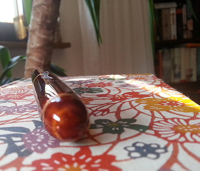
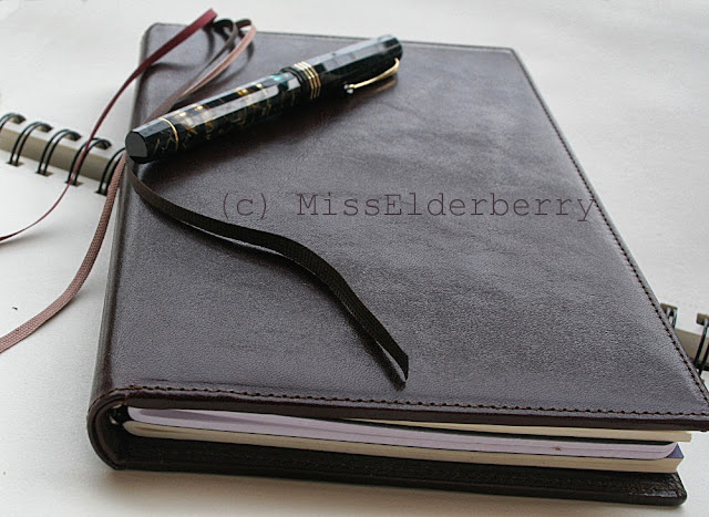
X47 MaBook notebook

X47 products aren't aimed at the youthful traveler but rather the distinguished businessman. Being neither of these I still like both systems and appreciate the variety. The MaBook immediately gives the impression of being extremely well made. The books are sewn by hand here in Germany using fine calfskin. The leather has a glossy surface which doesn't show minor scratches and also should be pretty immune to stains and discoloring. It should keep its pristine look for many years - no patina intended. Still - and very importantly at least to me - there is no plasticky feel to the surface and at the spine or the pen loop you can feel the leather is soft and supple.

The front and back cover seem to have some sort of stiff inlay so the book provides a hard surface to write on even if it's just resting on your legs. Let's look inside!

 X47 MaBook notebook - inside the front cover 

This is the inside of the front cover. There is room to insert an additional A6 notebook which is really neat. The one I'm using right now is slightly smaller than A6 (but it has Tomoe River paper! :D)

I'm not sure what the thing above the notebook space is for. It's a stamp sized opening with a leather flap which you can pull out. I've tried to imagine some use for this but can't really find one. Storing passport photographs maybe? Someone definitely put some thought into this so I'd like to find out. Let me know if you have any ideas!
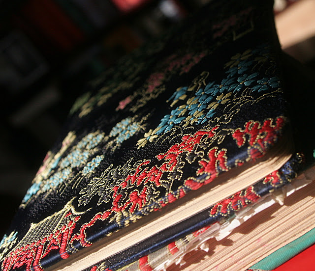
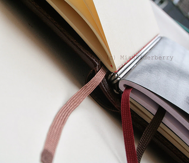
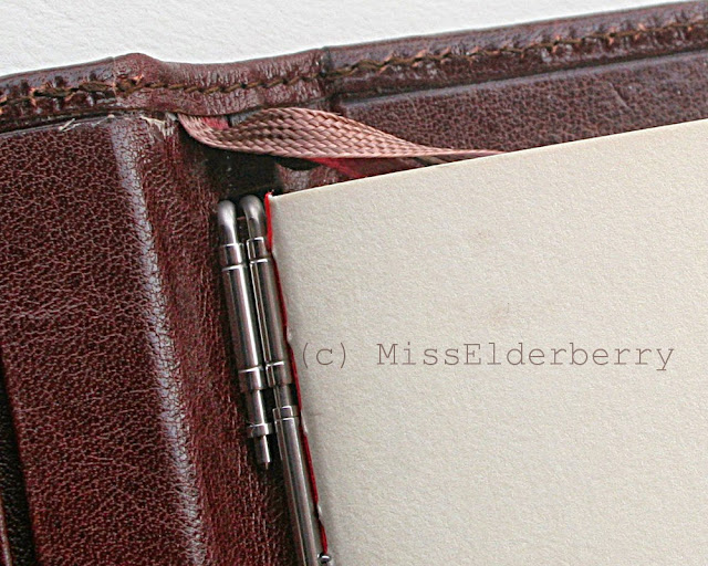
X47 MaBook notebook - the lower end of the spine and beautiful ribbon bookmarks.

It's plain that there are no Midori-like rubber bands here. Also there's apparently nothing going through the middle of the refill notebooks. So how do you put a refill in there?

The answer lies within these slim metal rods. The curvy parts belong to the MaBook covers. The straight parts can be taken out and have two thorns which go through the spine of the refill. The ready made refills provided by X47 already have a rod attached to them so exchanging them is quick and convenient. They're also not hard to "hack". Remove the rod from the original refill and attach it to any cahier you'd like. All you need to do is punch two small holes into the spines at the right location.

My MaBook now houses a Midori MD light, a Rhodia and a Semikolon cahier. A fourth notebook could be added but as the Rhodia is pretty thick I'll stick with three for the moment.

X47 MaBook notebook - inserts are held by slim  metal rods

Here's the metal rod holding the Midori MD notebook in place next to one not holding a refill. The system is nice because it takes very little space inside the MaBook, much less than rings, and of course looks more elegant than rubber bands. On the other hand it's an additional effort if you want to use your own refills.

As you can see above there are three differently colored ribbon bookmarks sewn into the spine. The ends of those seem to be dipped in resin or glue, they are a little stiff and won't unravel for a long time. Another one of these well thought out and beautiful details.

The X47 MaBook notebook is full of nice details.

There's also a pen loop large enough to hold fountain pens. These last pictures show the color best (the light wasn't too great when I took them), a deep chestnut brown. They also come in black and red with various finishes, even crocodile print if you're into that.

The inside of the back cover has additional room for some business cards. X47 have told me there is already a new generation of the MaBook with extra space for some sticky notes but I'm just as happy with the old one. They come in A5 and A6 size, mine being the A5 one. It weighs 570 grams with 3 refills. The manufacturer can be found here: X47

How do you like the MaBook? I have to say I feel a little intimidated by it sometimes as it's such a nice piece of work and I feel like I'd need to become some bigwig CEO to use one. However the book still appears slim and subtle and unobtrusive enough to use in any daily context - even if you, like me, don't plan ever to be a bigwig of any kind.


Wood & Silver: Montblanc l'Aubrac

$
0
0
Many pens have found to me because they had a specific something that appeals to me: The surface (Urushi), the materials (wood, ebonite, celluloid or, still one of my dreams, horn), the nib, maybe even the overall shape of the pen or something entirely different. In case of the l'Aubrac there's even several different reasons for me to love it. 

Montblanc l'Aubrac
 Montblanc l'Aubrac (resting on a very nice embossed leather notebook by Il Cartiglio) 

There's the gorgeous dark brown Grenadilla wood. The surface isn't lacquered but treated with wax. It feels silky smooth and very much like wood. The surface isn't perfectly plain, there are tiny grooves which is typical for grenadilla. They can be seen and felt. So can the decorate silver nails hinting at the shaft of a Lagouilé knife - the pen being a jointventure of Montblanc and knife manufacturer Forge de Laguoilé -, their rounded heads slightly protruding from the wood. 

 Montblanc l'Aubrac
The whole pen is an invitation to touch and fumble it, rest it in your hand.
Feel the warm and silky wood, the cool and glossy silver

Montblanc l'Aubrac

Except for the clip all metal accents are silver and elaborately engraved with floral motives. It would be slightly too much if not for the planes of dark, smooth wood to counterbalance it all.

Montblanc l'Aubrac

Mother of pearl snowcap catching the light (and there's my bookshelf, reflecting in the silver!)

Montblanc l'Aubrac

Montblanc l'Aubrac

The nib.
I chose a BB nib for it as it's one of the Montblanc nib sizes I didn't have and tried it for a while but found it too bulky. I sent it to John Sorowka for a regrind to cursive italic and some adjustment as it was also quite sensitive to some inks, some papers, hand oils and writing angle. He did great work, as always.

 Montblanc l'Aubrac BB CI - writing sample on Tomoe River paper 

Inked it with Montblanc Toffee Brown at the moment. I like when the ink matches the color of the pen to a degree where it seems the pen is putting its own essence onto the paper.

(Also I'm having trouble inking, for instance, a bright red aka-tame nuri Urushi pen with lilac or brown ink. I mean I CAN do it if I really want, but it feels uncomfortable. Weird, isn't it? Do you have any similar quirks with your pens and inks?)

 Montblanc l'Aubrac BB CI - writing sample 

Written on a sample sheet of Tomoe River that came with my Design.Y notebook. Great paper - someone sell it in the EU please! :)

A large pen - as large as a Meisterstück 149 -, though it has the smaller 146 nib. Heavy too: 57 g with cap, though it shrinks down to rather reasonable 35 g when uncapped. Posting the cap is, I believe, not an option but I don't do that anyway so I haven't tried.

How do you like the l'Aubrac?
Viewing all 94 articles
Browse latest View live